Visions 03 — Comparing Retail & Architectural Photography
For a few years now, I’ve billed myself not as much as an architectural photographer, but rather as a retail interior photographer. Although related, I feel there are some major differences which I would love to discuss.
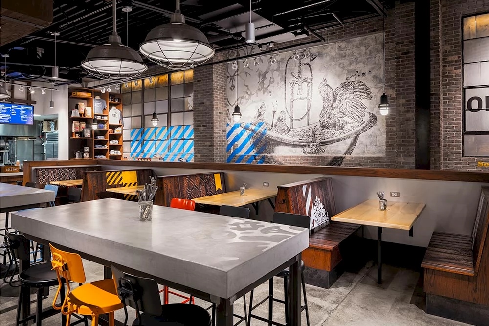
First and mainly, architectural photography is about space and balance while retail photography focuses more on the story telling of the brand for which the space was created. Thus, much of the story is about merchandising and the interior elements that enhance product placement. These elements tend to focus more on the colors, signage, textures, merchandisers and products as well as customer touch points and pathways.
Because of the need to tell a branding story, retail photography lends itself to a much tighter vignette style of images due to the need for retail environments to shift between sub-brands or product. Detail imagery becomes more important because colors, type style and textures plays a more important role here. Retail design tends to love its touch points with consumers and its documentation strives to show those points.
Another difference is how architectural photography is about the actual look and feel of an overall space, warranting clean overall images, while retail photography seeks more brand energy. I like to say that I photograph the “design intent” of retail design due to the fact that I may exclude what I feel unnecessary from a particular image to reinforce a statement. Since this lends itself to the more vignetted style versus the overall images, it allows firms to discuss each visual and touch points with better intensity.
Another factor that I will quickly touch upon is the use of lighting. Architecture images tend to use a more natural light approach while retail images will often use enhanced lighting to focus on more important points within the environment. I will often use lighting to bring out color and texture, focus on branded products, enhance the intended consumer path through a space or call attention to any important or subtle detail.
If you take a look at my site, you will see many instances of the above. I feel that Lowe’s Manhattan in particular is a very nice example of the above. You can view the images here. You should notice how branding colors are more dominant as well as product merchandising instead of architecture elements. Lowe’s branded coloring pops within the images and merchandise becomes more important over architecture details.
There may be times when the architecture is part of the story. In that case, there are ways to work the space into the branding story. A great example of this would be the City Target story I photographed for Fitch and Target. You can see the images here. I feel this is a great merging of the two styles into a cohesive story that maintains the architecture as well as the branding allowing each its own part of the mix.