Photographing the Light

Considering the overall lighting of a space is critical when photographing its atmosphere. Not enough fill and shadows lack details, woodgrains become muddy and bright colors drab. Meanwhile, too much light and highlights become bright pockets while the overall mood of a space lacks contrasts and textures.
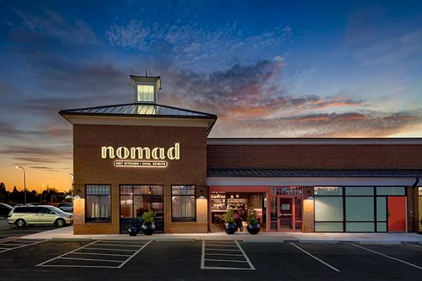
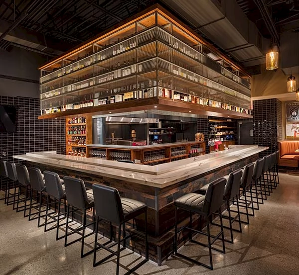
I recently photographed a restaurant in Columbus, OH with which I feel the results are a beautiful blend of light, colors and textures. Nomad, designed by Sketch Blue with GRA+D Architecture and Design, was inspired by travel. The palette of the site features black tile representing charcoal from the charcoal oven; warm tones representing flames; and artwork representing the culture of travel and Spain. These are blended with the senses with the smells of cooking food and the mood lighting.

The lighting of a space such as this can be a bit tricky to capture. Supplemental lighting must look natural as many of the lighting fixtures in the site are mainly for mood and theme, and not so much for brightness. It’s also this low glow value that creates a very warm mood that can easily become too warm to render the site with a natural feel. If I take too much of that warmth out, it lacks the feel of travel and quaintness. My overall baseline in a shoot as this is that neutrals at the customer level should be mostly a natural color.
Take a look at the rest of the images here and let me know what you think. And if you’re in Columbus and looking for some a nice dining experience, look up Nomad.